
Your Weekly Creative Practice
See Color Differently

Your five-minute practice starts here — every Sunday. Drop in any week — each practice stands on its own.
Each Sunday, we’ll give you one simple creative exercise. Five minutes. No experience required. No pressure to be good.
This is Week 7
If you’ve been playing with color stripes like we have, you’ve already started training your eye. You’ve noticed how certain color combinations slow you down, how others feel electric. This week, we’re going deeper into why that happens — and then we’re going to take it outside.
Part One: Your Walk Is a Color Lab
Before you pick up a pen or pencil, go outside for five minutes. Your only job: find complementary colors in the wild.
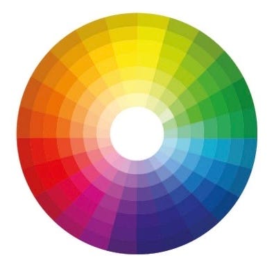
Complementary colors are any two colors that sit directly opposite each other on the color wheel — think orange and blue, red and green, yellow and violet. They create natural tension and contrast. When placed next to each other, they make each other more vivid, more alive.
Once you know this, you can’t unsee it. A terracotta pot against a blue sky. A red front door in a sea of green hedges. A yellow taxi on a grey street (grey has violet undertones — look it up).
here is an examples we noticed last night — orange and blue — two colors that sit directly opposite each other on the color wheel (nature does color combinations effortlessly every time).
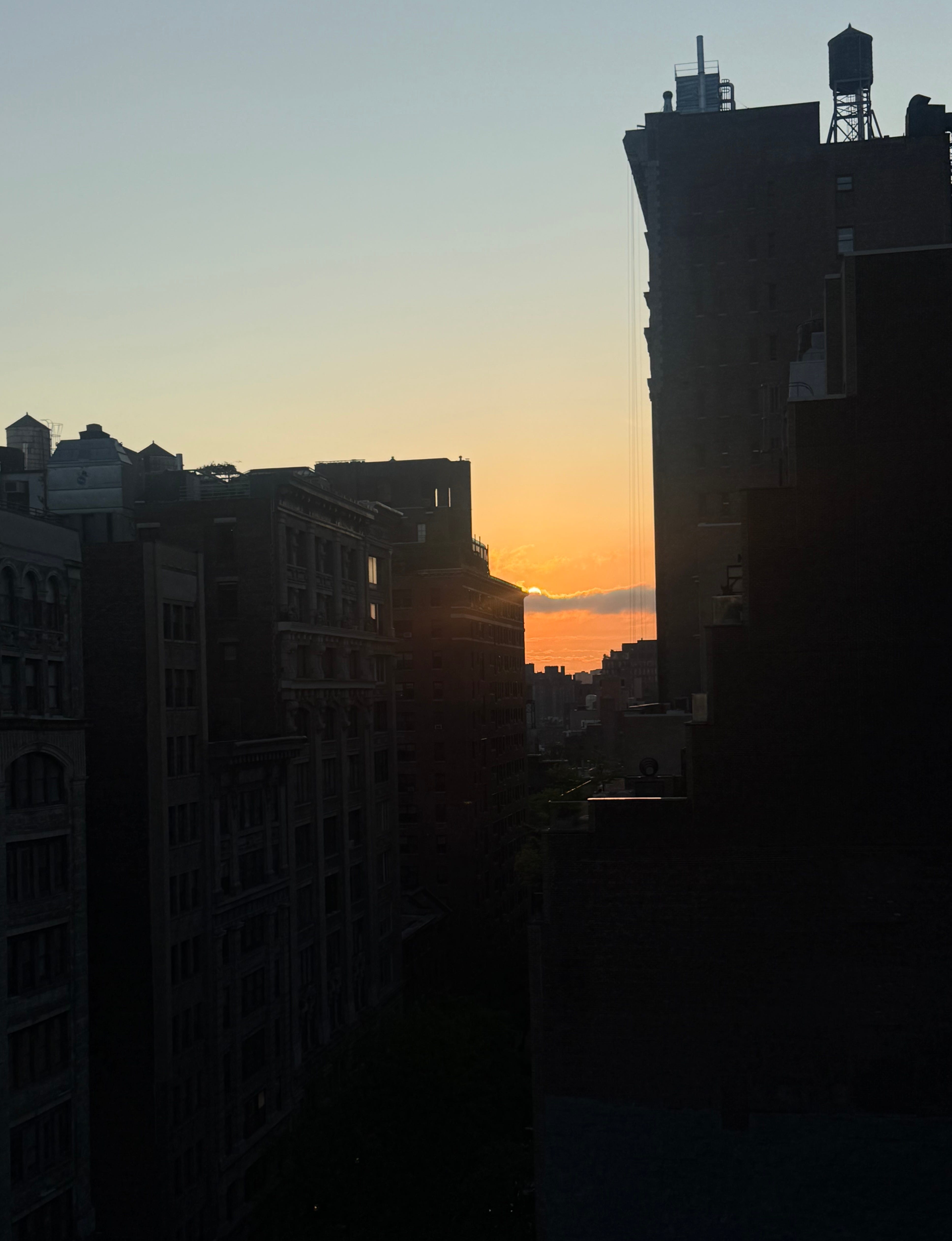
Here’s why this combination feels so good: when complementary colors appear side by side, each one makes the other more intense. The orange in this sky looks more vivid because of the blue surrounding it, and vice versa. They’re in tension, and that tension is what makes it electric. Your brain registers this. Complementary pairings create higher contrast signals in the visual cortex — your eye bounces between the two colors, which is why these combinations feel alive rather than calm. It’s not just aesthetic preference. It’s biology.
Snap photos on your walk or just make a mental note. The goal isn’t to find the perfect combination — it’s to start seeing color in a new way.
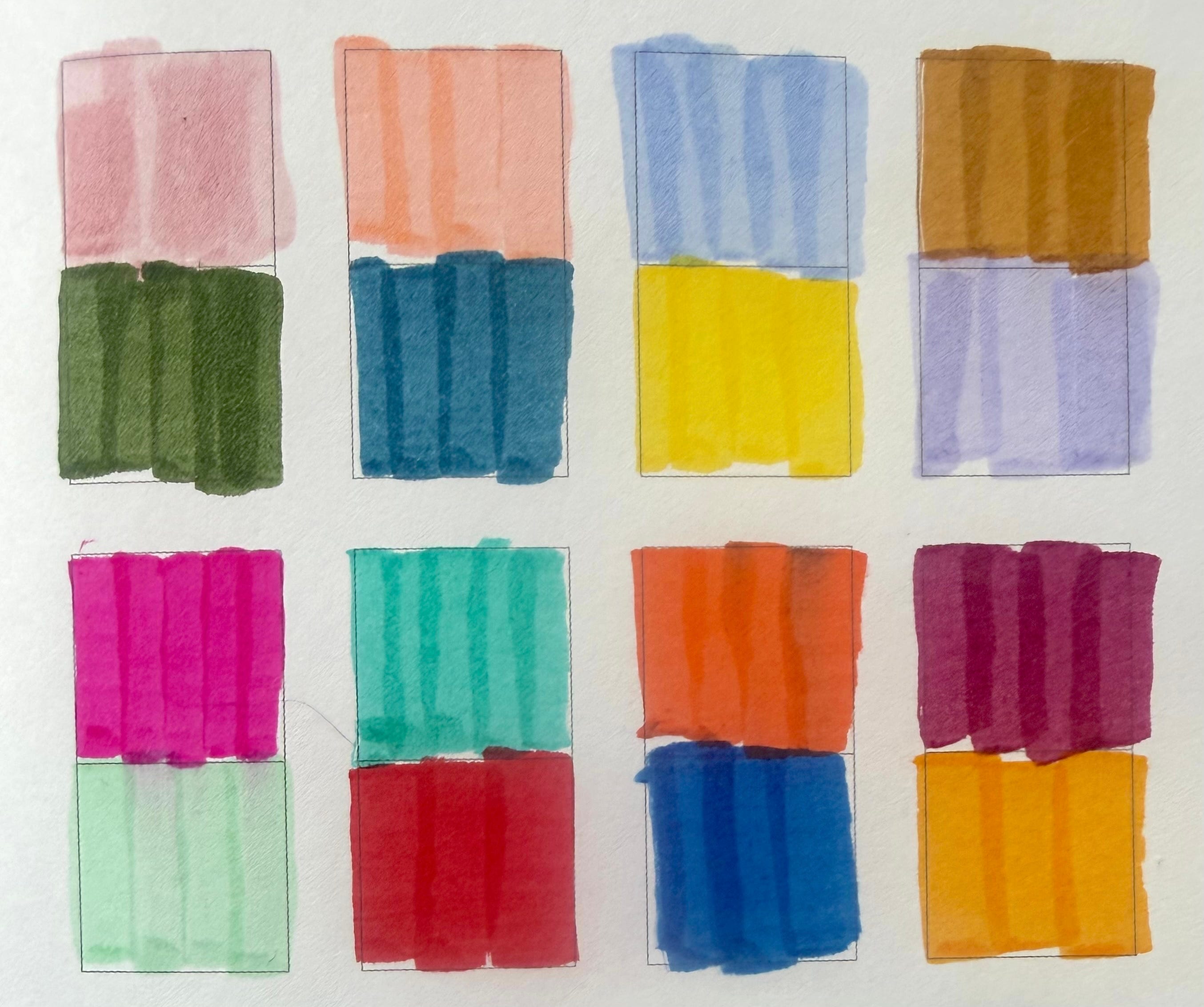
Part Two: Make Your Own
Now bring it inside. Using colored pencils, markers, or whatever you have on hand, experiment with your own complementary color pairings. Draw stripes, color blocks, anything — the format doesn’t matter. Play with value and saturation: a pale lavender against a muted olive hits differently than a bright purple against lime green. Notice what surprises you. Here is a color wheel for reference:
Here is a video of our attempt in our book (note: you can do this on a blank piece of paper, and we always support doing it in your own way):
What are your favorites? Share them in the comments — we want to see.
xo Mallory
New to the Weekly Creative Practice? Start anywhere. And if you want the full color chapter — color harmony, the color wheel, all of it — it’s all inside the book: Daily Creative: The Five Minute Habit to Rewire Your Brain